Family Health Care Network
A brand identity for a nationally recognized community healthcare provider committed to quality care for all.
Brand Strategy: Sean Tambagahan
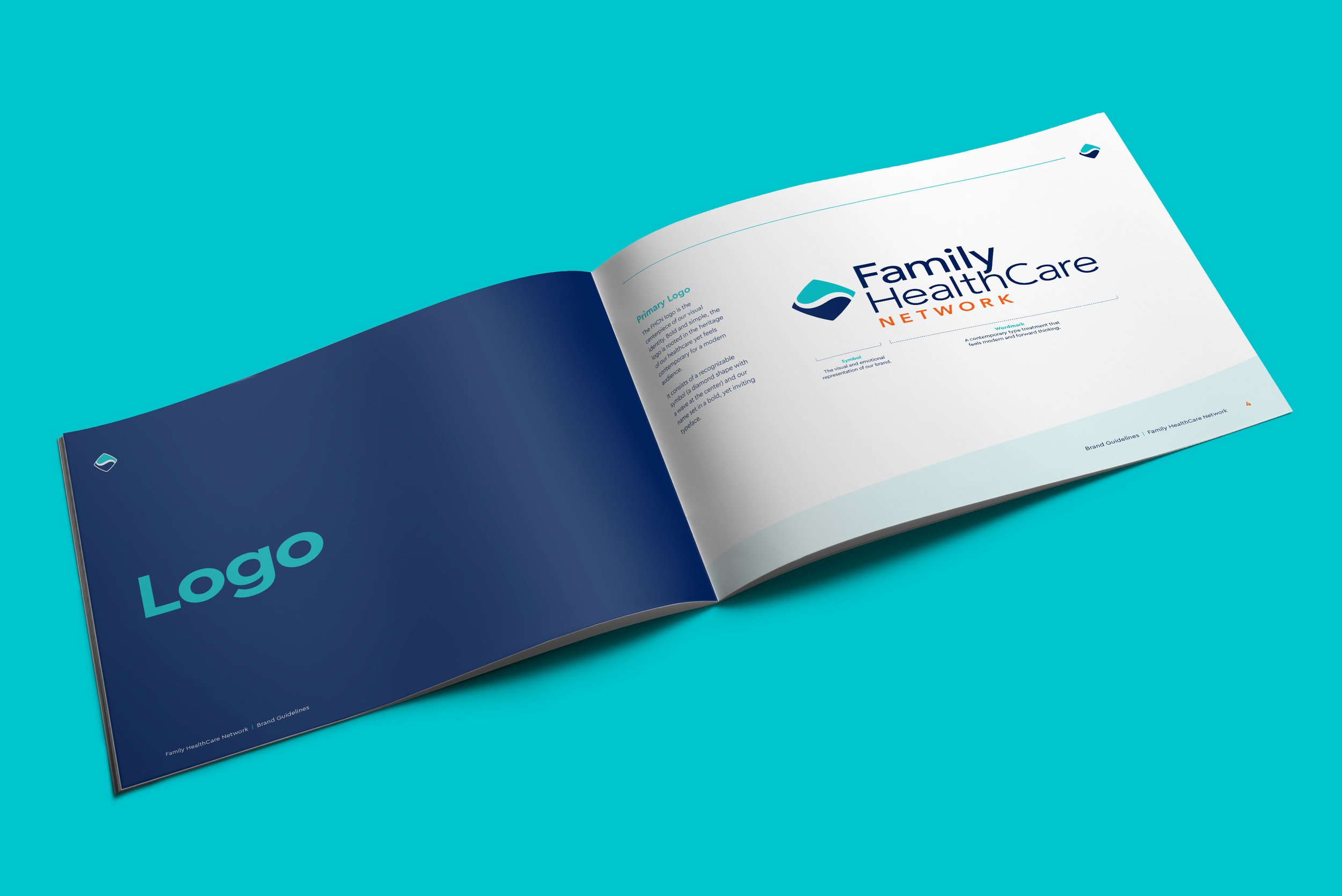
Inspired by the ‘wave’ motif from the original logo, the new FHCN symbol has been created for a modern world, while staying true to it’s heritage.
Original FHCN logo with the brushstroke ‘wave’ design.
New Logo


