![](https://images.squarespace-cdn.com/content/v1/5e0045241f53ca06a5de5c77/a5e79c54-bda8-4ede-b646-9bee770f1081/GOLD_CaseStudy_Header.png)
Goldberg & Ibarra
brand identity
brand identity
Brand identity for a law firm working to protect the rights of the disadvantaged, seriously injured, and disabled.
![](https://images.squarespace-cdn.com/content/v1/5e0045241f53ca06a5de5c77/3e49d56f-5291-434f-9f18-776c3ffc67d0/CO_Work_GOLD_Pin_Mockup.jpg)
Brand Strategy: Sean Tambagahan
Goldberg & Ibarra is a leading personal injury law firm known for its client-focused approach and proven success. With decades of combined experience, the team provides expert, empathetic representation, securing significant recoveries and delivering justice. Their dedication and relentless advocacy have made them trusted leaders in the legal field.
-
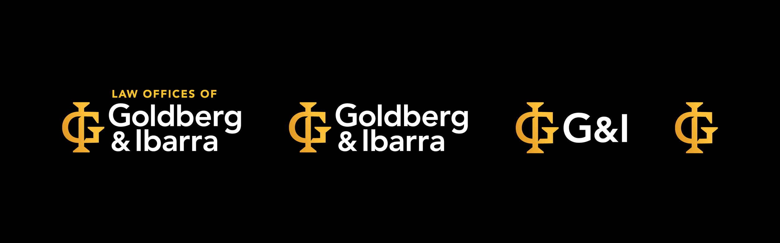
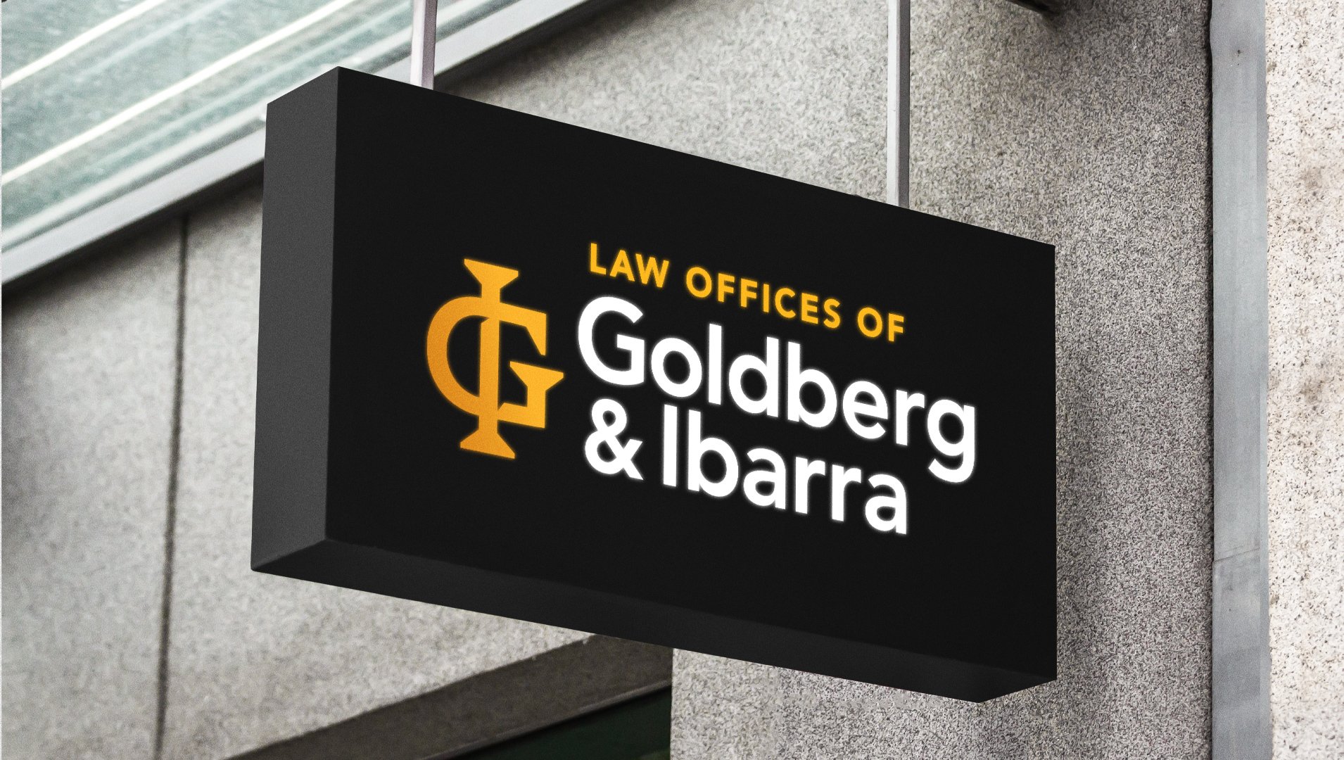
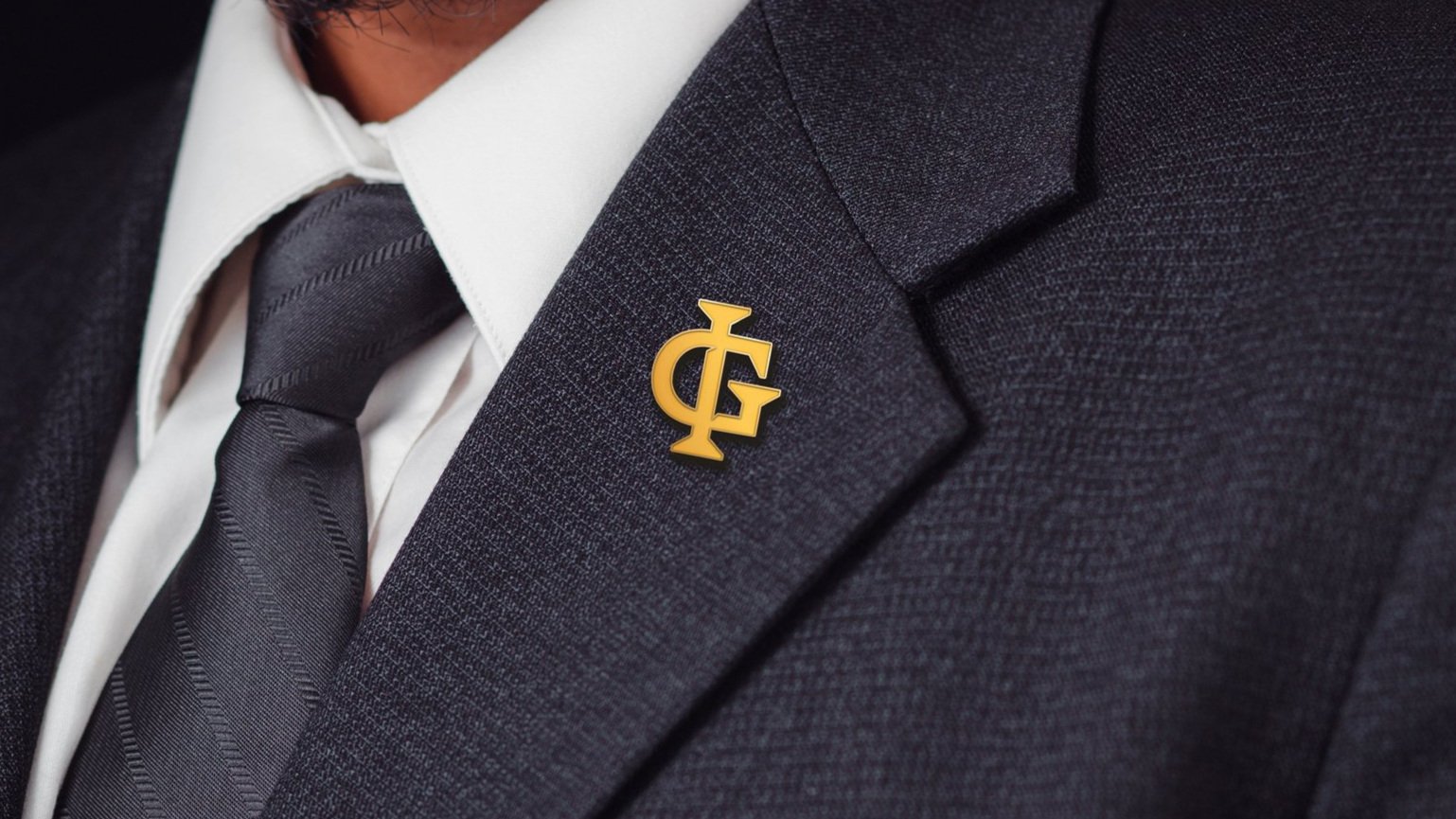
Goldberg & Ibarra wanted to rebrand to modernize their image and better communicate their dedication to clients. The goal was to create a visual identity that reflected their professionalism, trustworthiness, and commitment to results. As the graphic designer for this project, I led the development of their new visual identity. I focused on crafting a cohesive brand aesthetic that reinforced their values and ensured a consistent, impactful message across all platforms.
![](https://images.squarespace-cdn.com/content/v1/5e0045241f53ca06a5de5c77/219054de-3e44-4a6e-957a-9ded6813cd5b/GOLD_CaseStudy_Monogram.png)
![](https://images.squarespace-cdn.com/content/v1/5e0045241f53ca06a5de5c77/b0d55a0b-0cc4-4df1-a5f3-ef597f569724/CO_Work_GOLD_InstagramMockup.png)
The new identity introduces a monogram that integrates the initials “G” and “I” into a bold, unified symbol. The oversized serifs convey strength and tradition while the golden gradient adds sophistication, reflecting the firm's commitment to excellence and trust.
![](https://images.squarespace-cdn.com/content/v1/5e0045241f53ca06a5de5c77/9c8e2c99-0d12-45d2-a7ab-793a3a9ef603/GOLD_CaseStudy_Responsive_Logos.png)
The Goldberg & Ibarra logo system is highly responsive, ensuring consistent brand representation across platforms. Adaptable variations maintain visual integrity on signage, digital, and print materials, providing scalability and readability. This flexible design enhances brand presence, keeping it recognizable and professional in any context.
![](https://images.squarespace-cdn.com/content/v1/5e0045241f53ca06a5de5c77/30a94993-aaf8-435a-81bd-95ea8b16b822/GOLD_CaseStudy_LogoConstruction.png)
The grid overlay highlights precise alignment, symmetry, and proportion, ensuring balance between the two letterforms. Guide lines showcase the methodical approach for consistent spacing and geometric harmony, resulting in an elegant, cohesive monogram.
![](https://images.squarespace-cdn.com/content/v1/5e0045241f53ca06a5de5c77/c16f96c8-14cd-4b3a-bedb-0e9d9f1a23a6/CO_GOLD_Signage.jpg)
![](https://images.squarespace-cdn.com/content/v1/5e0045241f53ca06a5de5c77/2bfc45fc-ee88-4122-b952-60628bcb5ce6/CO_GOLD_BusinessCards.jpg)
![](https://images.squarespace-cdn.com/content/v1/5e0045241f53ca06a5de5c77/10e5e89a-bd53-4a26-9947-69f3b7646b9e/CO_GOLD_LogoLetterhead.jpg)