Rise Utility
Brand Identity
Brand Identity
Brand identity for a collective of entities that offer interconnected services in utility consulting, design, and construction.

Rise Utility operates as a cooperative of specialized entities, united by a commitment to delivering seamless utility solutions. By integrating expertise across consulting, design, and construction, Rise Utility delivers comprehensive utility services that transform infrastructure challenges into community advancements.
-
As the graphic designer for the RISE Utility project, I was responsible for designing the visual identity. This involved creating a cohesive visual language that reflected the company’s commitment to excellence and efficiency. I developed the logo system, typography, and color schemes, ensuring that the design aligned with the company’s core values and resonated with its target audience. The identity I crafted serves as the foundation for RISE Utility’s visual presence, establishing a strong and consistent look across all materials.

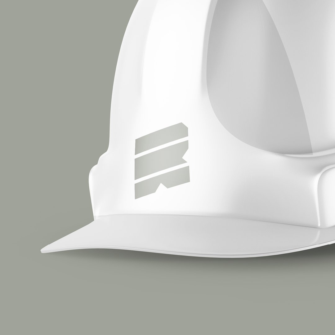
The mark is made up of three slabs in the shape of an ‘R’ that represent the core aspects of the business—design, consulting, and construction. The angular, upward-slanting design symbolizes the word "Rise," reflecting progress and forward momentum.


The Rise Utility logo was designed to adapt across various applications with multiple variations, including a primary, vertical, horizontal, and a standalone icon.


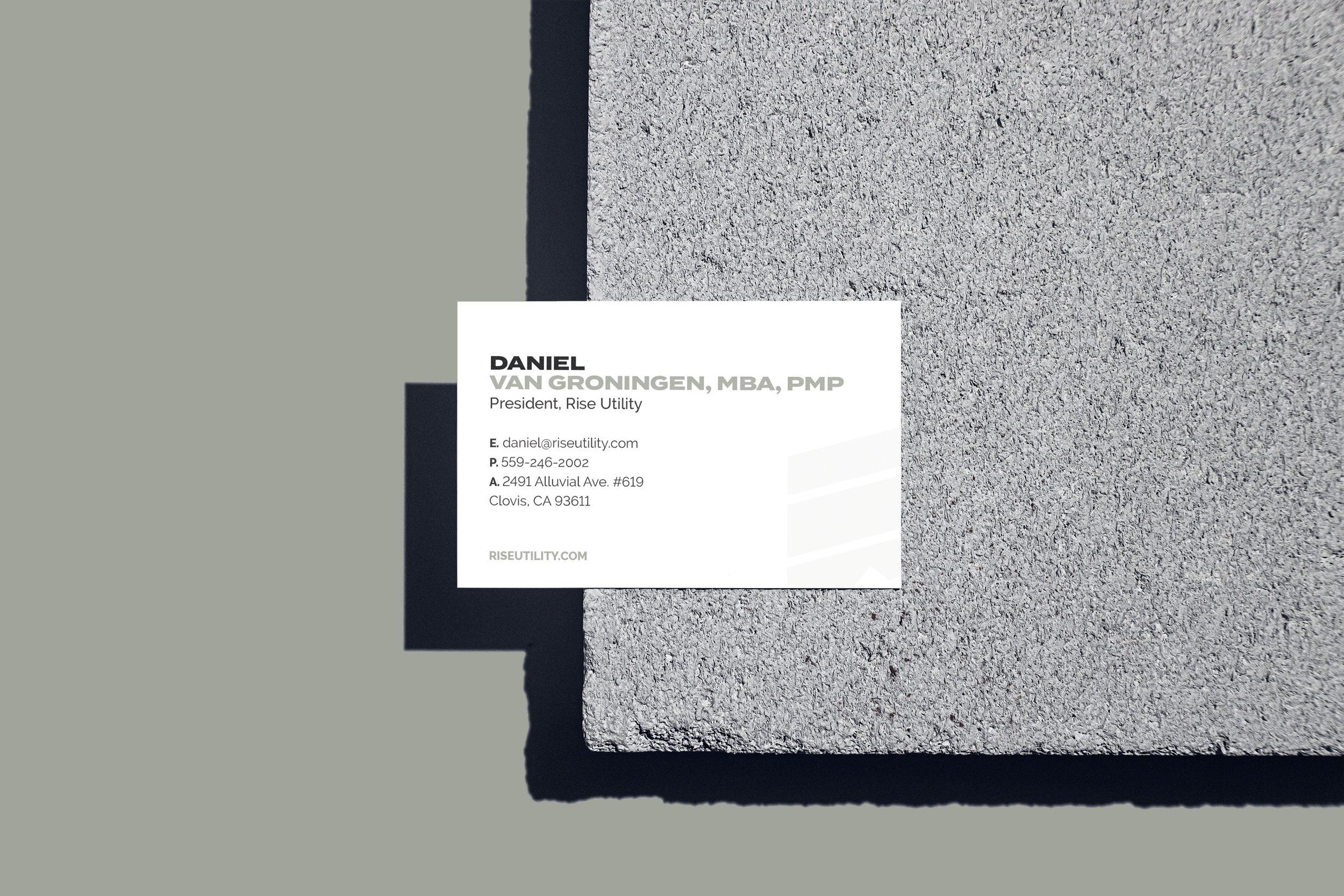
The identity maintains its impact across applications including embroidered form and printed materials, ensuring clarity and recognition on both professional and casual settings. This adaptability highlights the strength of the identity system, ensuring consistency and versatility across various branded materials.

